Graph design
By default Excel graphs may not always look very good and with only a few tricks you can greatly improve them. Below is a step by step guide to design better graphs and then save your graphs as templates tu re-use them later.
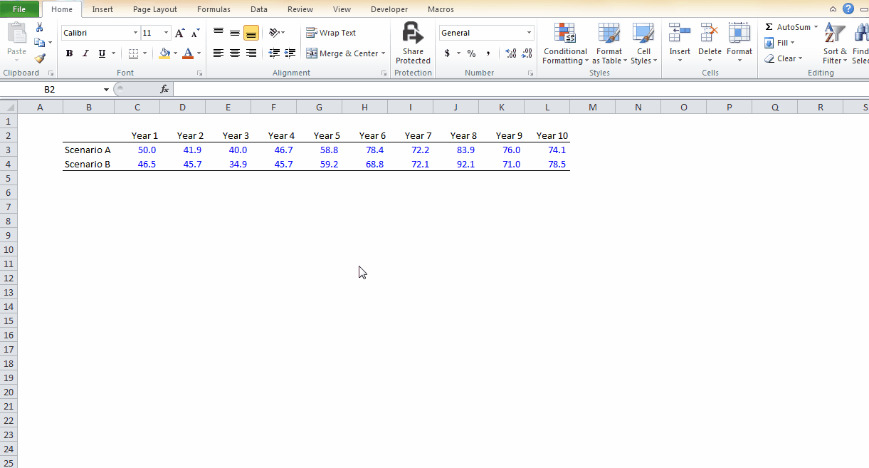
1. Select the data and a basic chart type
2. Remove the borders

3. Use all space available in the chart area

4. Change the format of the legend

5. Make the gridlines lighter

6. Set the position of values on tick marks rather than between tick marks

7. Change the number format

8. Change the colors

9. Adjust the scale to maximize the use of all the space available

10. Result

11. Save your graph as a template
You do not have to go through all these changes every time, you can save the graph you have designed to use it again in any subsequent model.
Steps
1. Select the graph you wish to save
2. Go to Design / Save as Template
3. Choose a name for this template
4. That's it! Next time you want to use this template select the input data, go to Inser / Insert / All chart types
5. Select the template you have previously saved
